Renewed Hope Counseling
New branding for Renewed Hope Counseling.
oVERVIEW
The Mission - Renewed Hope Counseling needed a unique brand identity to stand out in the market. RHC seeks to restore hope in the hearts of Christian women and the client desired a feminine, clean, and modern logo to use as the practice grows.
The Challenge - Christine was drawn to medallion-style icons for the logo, which presented the challenge of simplifying a typically intricate design to its most simplest form without compromising clarity.
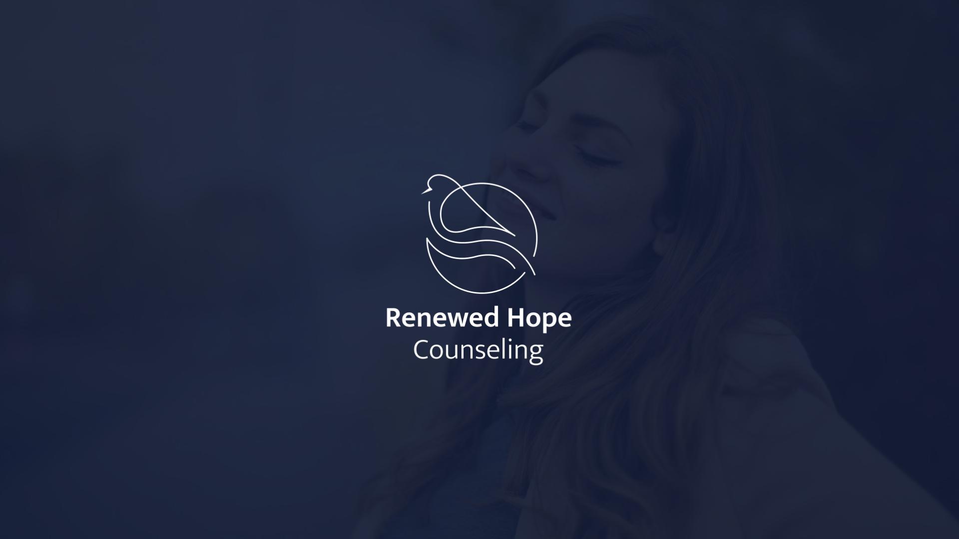
The Outcome - The end result came together beautifully as we decided to focus on combining a dove and a leaf. The dove is an iconic Christian symbol for the Holy Spirit, which is vital in the healing and restoration of a broken heart. A leaf is recognizable beneath the dove and symbolizes growth and maturing. The overall composition is feminine and accurately represents Christine's heart and passion for Christian counseling.


